Mobile Web Development Best Practices – Starting Tips

My last two articles, reviewing my work for both the Almay/Facebook project and the new Mitchum site, have tried to drive the same point home: it’s good to apply mobile web development best practices when coding up a website, even if the site is only meant for desktop browsers. This article expands on that point.
Here are the topics for this article:
- Why We Need To Code For Mobile
- The List of Tactics
- The Golden Rule Of Site Speed
- The Images
- The Page Elements
- Tweak All The Files
- Compress The Files
- YSlow & Page Speed
- Conclusion
Why We Need To Code For Mobile
There are two good reasons for you to start “thinking mobile” when writing code:
- applying mobile development tactics to a desktop-based website results in a site that loads faster.
- in April 2010, Google announced that site speed would be factored into their search algorithm. They were only doing this for 1% of sites at the time of the announcement and I can’t find any statements by Google saying that the number has changed. But you can bet that it will increase as mobile usage, which is VERY dependent on fast-loading sites, also increases.
The List of Tactics
Following the suggestions mentioned in YDN’s “Best Practices for Speeding Up Your Web Site” article is the best way to begin building some best practices into your coding habits. The article lists many things but for now, let’s just focus on some beginning tactics:
- optimize all your photos and graphic files for fast loading
- make sure each page has as few page elements as possible
- remove code that you’re not using
- compress your files
- constantly test your page speed with Yahoo’s YSlow tool and Google’s Page Speed tool
This outlines the “mobile thinking” method I used when doing the Almay/Facebook project I mentioned…let’s walk through that.
First, let’s look at the What’s New section on Almay’s Facebook page which is three pages long and the end result of all this “mobile thinking.” Feel free to review it as you’re reading.
Next, let’s look the golden rule of site speed…
The Golden Rule Of Site Speed
In 2010, the Yahoo User Interface team ran thorough tests on the cache limits of the most-popular mobile devices. They found that the iPad running iOS 3.2 had the lowest limit, only caching elements that were 25.6kb or less.
It’s important to note that newer iOS devices have, at least, double this cache limit. It’s also important to note that these tests show that devices with an older iOS didn’t cache anything at all, affecting older iPhones. And, interestingly enough, the cache limit for the Android 2.1 OS and up can go up to a whopping 2MB!!!
Therefore, the Golden Rule Site Speed is to try to keep the page element file sizes at 25.6kb or lower: this was my mindset during the Almay/Facebook project. Older iPhones can’t cache anything at all: there was nothing I could do about this so I didn’t worry about it.
The Images
With this file size limit in mind, I created image sprites for almost all the site images. I basically compiled a lot of my images into one image like this:
[![Almay Image Sprite][19]][19]
[]: /img/copyArrowConcealerSprite.png [19]: /img/copyArrowConcealerSprite.png
As you can see, this 24kb transparent PNG bundles six images used on the Almay Facebook page, most of which will be used on all three pages of the Almay/Facebook page. I basically used CSS to display certain parts of it when I needed to, while effectively blocking out the others.
Since its file size is less than 25.6kb, the image will be stored in browser cache for most mobile devices. So when it’s needed on other pages, it will be pulled from the cache instead of getting called from the server. The less calls made to the server, the faster the site will be.
There are tons of great sprite tutorials out there so there’s no need for me to create another one. This sprite tutorial at CSS Tricks is simple, yet descriptive. Give it a read.
The Page Elements
As you’re coding, keep a constant eye on how many page elements, or DOM elements, are on the page. A page element is any tag that you have on the page: , , , etc. The less you have, the faster the page loads.
Using the Console in either Firebug for Firefox or Google Chrome Dev Tools is the easiest way to do this. Let’s use the one in Chrome tools:
- open your page in Google Chrome
- right-click on somewhere on it and click “Inspect Element”
- click on the “Console” Button
- a command-line prompt will open…type the following line:
document.getElementsByTagName("*").length
What this line is saying is:
- “Go through the entire page and search for all the page elements with a tag name. We definitely want all of them so we’ll add a wildcard symbol, which is “*”. We also want to see the exact number of how many you found, so we’ll end our command with “length.”
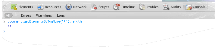 By doing all of this, I got the page down to 44 elements, which is great! But…
…while having a low amount of page elements is important to site speed, I don’t see them as weighing the page down TOO much. The YDN article points out that the Yahoo! home page loads pretty fast and it has a little less than 700 elements. Yes, the elements should be marked up correctly, but I wouldn’t spend a whole lot of time keeping the total page elements down when you have other things to do. I say, track it…don’t over-think it.
Tweak All The Files
The less code on your page, the smaller its final file size will be. It’s that simple.
I attached the HTML5 CSS Reset file that comes with HTML5 Boilerplate to these pages, which not only makes your site more cross-browser compliant, but also safely renders the newer HTML5 elements on the page without issue.
At a lowly 9.6kb, this file follows the Golden Rule. But I still made it smaller by doing the following:
- the stylesheet adds code for CSS3 media queries…I didn’t create media queries so I deleted that code.
- the stylesheet adds code for that target’s Internet Explorer 6…I didn’t code for IE6 so I deleted that code.
- the stylesheet adds a lot of extra CSS classes that I didn’t even come close to using so I deleted that code.
- Page Speed (which I’ll discuss shortly) showed me which CSS code wasn’t being used so I deleted that code.
Compress The Files
After you’ve tweaked the files as much as you can tweak them, it’s time to compress them, or, “minify” them. Using HTML5 Boilerplate’s build script is the best way to achieve this.
This script does many things: removes unreferenced images, combines multiple CSS files into one file, runs the same combination process for JS files and so on. It also removes whitespace from files and shrinks the images using optiping and jpegtran: for this project, these last two things can in handy.
If you run the build script on a Mac OS 10.x machine, it will only run on a command line via the Terminal application. If you run it on a PC you can run it either on a command line via DOS or with a batch script that comes with the Boilerplate template.
IMPORTANT POINT: if you saved your graphic files using Photoshop’s “Save for Web and Devices…” functionality or something similar, the build script won’t shrink them anymore than that. There’s only so far that you can compress images and saving them out with this functionality takes them that far.
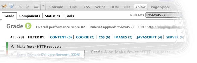
YSlow & Page Speed
As you’re coding, you should use Yahoo’s YSlow and Google’s Page Speed to estimate your site speed. Both are browser plugins for both Chrome and Firefox that scan your code and, based on its findings, grades how optimized for speed to determine how optimized it is.
YSlow grades site speed from A to F while Page Speed grades it from 0 to 100. So obviously, the higher the grade your site receives, the more optimized it is.
After tweaking images, deleting code, limiting page elements and minifying files, the Almay/Facebook earned a B from YSlow and an 85 from Page Speed. Not the highest marks, but good for now.
YSlow for Almay/Facebook Page
Page Speed for Almay/Facebook Page
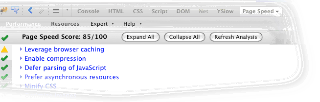
The are two reasons for the B/85 are:
- No content delivery network (CDN) to store images and files – we have one at Revlon but due to the depth of projects among the web team, we couldn’t configure it in time.
- No gzip compression – gzip compression is server-side functionality that compresses all the site files hosted on your server. This Almay/Facebook content runs on a .NET/IIS setup so setting gzip up would have meant adding the related code to the web.config file,testing it in a development environment, then pushing it to the live site…again, no time.
Conclusion
These are beginning tactics that mostly deal with front end code: there are many ways to speed things up on your web host as well. But if you’re just starting to “think mobile,” start with these steps, then ramp up on the server stuff.
We’re talking about the front end code I created for this Facebook project, but not Facebook itself. I have some things to say about this, none of it good. That will be the next post.